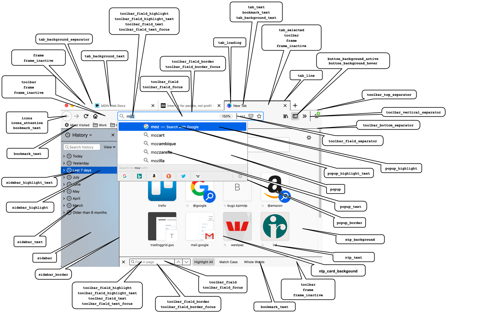
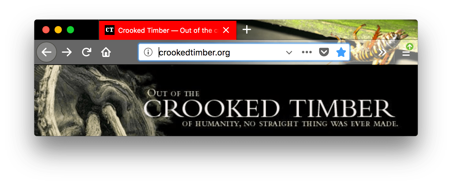
accentcolor Deprecated
|
Warning: accentcolor has been removed in Firefox 70. You will begin to get warnings in Firefox 65 and later if you load a theme that uses this property. Use the frame property instead.
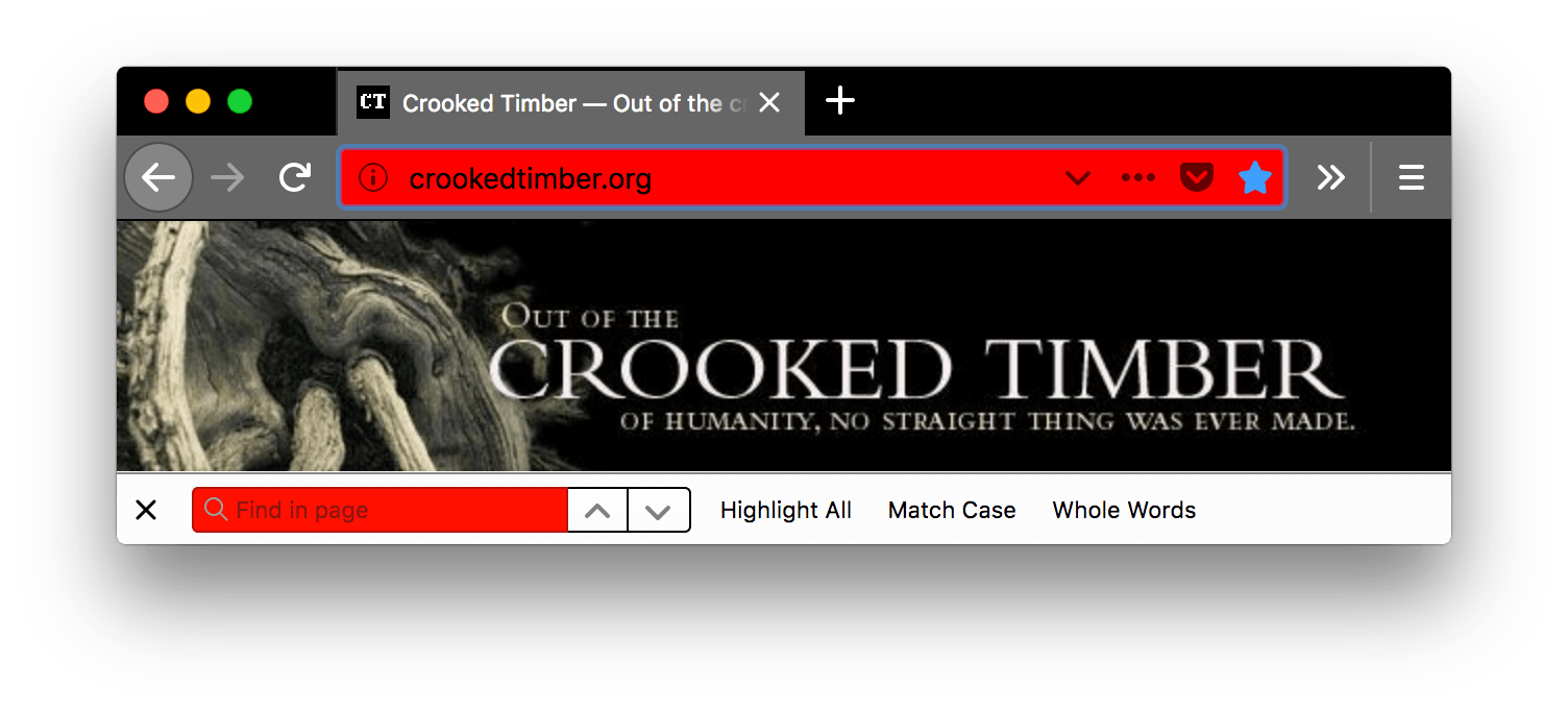
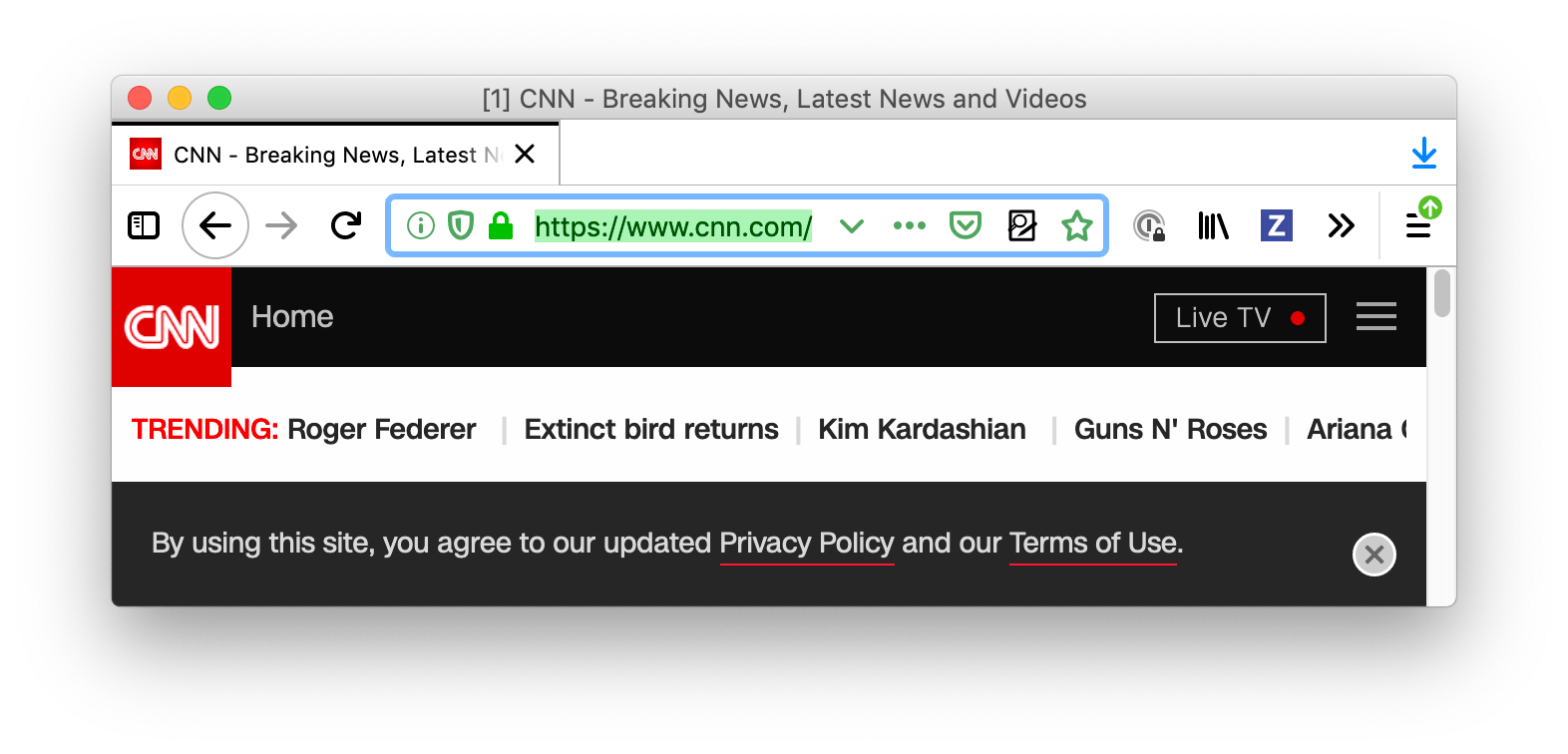
The color of the header area background, displayed in the part of the header not covered or visible through the images specified in "headerURL" and "additional_backgrounds".
See example
"theme": {
  "colors": {
     "accentcolor": "red",
     "tab_background_text": "white"
  }
}

|
bookmark_text |
The color of text and icons in the bookmark and find bars. Also, if tab_text isn't defined it sets the color of the active tab text and if icons isn't defined the color of the toolbar icons. Provided as Chrome compatible alias for toolbar_text.
Note: Ensure any color used contrasts well with those used in frame and frame_inactive or toolbar if you're using that property.
Where icons isn't defined, also ensure good contrast with button_background_active and button_background_hover.
See example
"theme": {
  "colors": {
    "frame": "black",
    "tab_background_text": "white",
    "tab_text": "white",
    "toolbar": "black",
    "bookmark_text": "red"
  }
}

|
button_background_active |
The color of the background of the pressed toolbar buttons.
See example
"theme": {
  "colors": {
     "frame": "black",
     "tab_background_text": "white",
     "button_background_active": "red"
  }
}

|
button_background_hover |
The color of the background of the toolbar buttons on hover.
See example
"theme": {
  "colors": {
     "frame": "black",
     "tab_background_text": "white",
     "button_background_hover": "red"
  }
}
|
icons |
The color of toolbar icons, excluding those in the find toolbar.
Note: Ensure the color used contrasts well with those used in frame, frame_inactive, button_background_active, and button_background_hover.
See example
"theme": {
  "colors": {
     "frame": "black",
     "tab_background_text": "white",
     "icons": "red"
  }
}
|
icons_attention |
The color of toolbar icons in attention state such as the starred bookmark icon or finished download icon.
Note: Ensure the color used contrasts well with those used in frame, frame_inactive, button_background_active, and button_background_hover.
See example
"theme": {
  "colors": {
     "frame": "black",
     "tab_background_text": "white",
     "icons_attention": "red"
  }
}

|
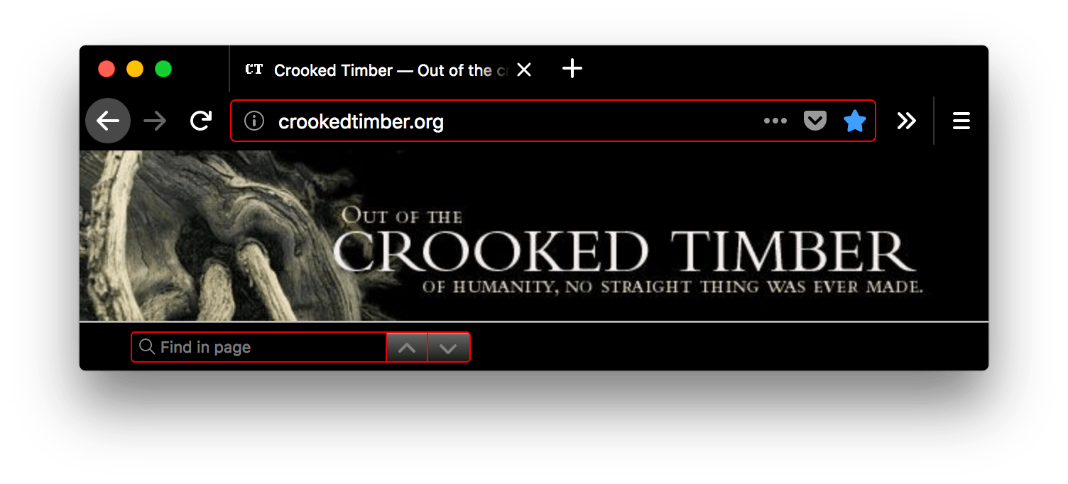
frame |
The color of the header area background, displayed in the part of the header not covered or visible through the images specified in "theme_frame" and "additional_backgrounds".
See example
"theme": {
  "colors": {
     "frame": "red",
     "tab_background_text": "white"
  }
}
|
frame_inactive |
The color of the header area background when the browser window is inactive, displayed in the part of the header not covered or visible through the images specified in "theme_frame" and "additional_backgrounds".
See example
"theme": {
  "colors": {
     "frame": "red",
     "frame_inactive": "gray",
     "tab_text": "white"
  }
}

|
ntp_background |
The new tab page background color.
See example
"theme": {
  "colors": {
     "ntp_background": "red",
     "ntp_text": "white"
  }
}

|
ntp_text |
The new tab page text color.
Note: Ensure the color used contrasts well with that used in ntp_background.
See example
"theme": {
  "colors": {
     "ntp_background": "red",
     "ntp_text": "white"
  }
}
|
popup |
The background color of popups (such as the URL bar dropdown and the arrow panels).
See example
"theme": {
  "colors": {
     "frame": "black",
     "tab_background_text": "white",
     "popup": "red"
  }
}

|
popup_border |
The border color of popups.
See example
"theme": {
  "colors": {
     "frame": "black",
     "tab_background_text": "white",
     "popup": "black",
     "popup_text": "white",
     "popup_border": "red"
  }
}

|
popup_highlight |
The background color of items highlighted using the keyboard inside popups (such as the selected URL bar dropdown item).
Note: It's recommended to define popup_highlight_text to override the browser default text color on various platforms.
See example
"theme": {
  "colors": {
     "frame": "black",
     "tab_background_text": "white",
     "popup_highlight": "red",
     "popup_highlight_text": "white"
  }
}

|
popup_highlight_text |
The text color of items highlighted inside popups.
Note: Ensure the color used contrasts well with that used in popup_highlight.
See example
"theme": {
  "colors": {
     "frame": "black",
     "tab_background_text": "white",
     "popup_highlight": "black",
     "popup_highlight_text": "red"
  }
}

|
popup_text |
The text color of popups.
Note: Ensure the color used contrasts well with that used in popup.
See example
"theme": {
  "colors": {
     "frame": "black",
     "tab_background_text": "white",
     "popup": "black",
     "popup_text": "red"
  }
}

|
sidebar |
The background color of the sidebar.
See example
"theme": {
  "colors": {
     "sidebar": "red",
     "sidebar_highlight": "white",
     "sidebar_highlight_text": "green",
     "sidebar_text": "white"
  }
}

|
sidebar_border |
The border and splitter color of the browser sidebar
See example
"theme": {
  "colors": {
     "sidebar_border": "red"
  }
}

|
sidebar_highlight |
The background color of highlighted rows in built-in sidebars
See example
"theme": {
  "colors": {
     "sidebar_highlight": "red",
     "sidebar_highlight_text": "white"
  }
}

|
sidebar_highlight_text |
The text color of highlighted rows in sidebars.
Note: Ensure the color used contrasts well with that used in sidebar_highlight.
See example
"theme": {
  "colors": {
    "sidebar_highlight": "pink",
    "sidebar_highlight_text": "red",
  }
}

|
sidebar_text |
The text color of sidebars.
Note: Ensure the color used contrasts well with that used in sidebar.
See example
"theme": {
  "colors": {
     "sidebar": "red",
     "sidebar_highlight": "white",
     "sidebar_highlight_text": "green",
     "sidebar_text": "white"
  }
}
|
tab_background_separator Deprecated |
Warning: tab_background_separator is not supported starting with Firefox 89.
The color of the vertical separator of the background tabs.
See example
"theme": {
  "colors": {
     "frame": "black",
     "tab_background_text": "white",
     "tab_background_separator": "red"
  }
}

|
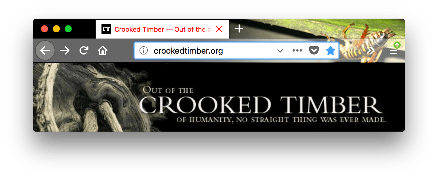
tab_background_text |
The color of the text displayed in the inactive page tabs. If tab_text or bookmark_text isn't specified, applies to the active tab text.
Note: Ensure the color used contrasts well with those used in tab_selected or frame and frame_inactive.
See example
"theme": {
  "colors": {
    "frame": "black",
    "toolbar": "white",
    "tab_background_text": "red"
  }
}

|
tab_line |
The color of the selected tab line.
See example
"theme": {
  "colors": {
     "frame": "black",
     "tab_background_text": "white",
     "tab_line": "red"
  }
}

|
tab_loading |
The color of the tab loading indicator and the tab loading burst.
See example
"theme": {
  "colors": {
     "frame": "black",
     "tab_background_text": "white",
     "tab_loading": "red"
  }
}
|
tab_selected |
The background color of the selected tab. When not in use selected tab color is set by frame and the frame_inactive.
See example
"theme": {
  "images": {
  "theme_frame": "weta.png"
},
  "colors": {
     "frame": "black",
     "tab_background_text": "white",
     "tab_selected": "red"
  }
}
|
tab_text |
From Firefox 59, it represents the text color for the selected tab. If tab_line isn't specified, it also defines the color of the selected tab line.
Note: Ensure the color used contrasts well with those used in tab_selected or frame and frame_inactive.
From Firefox 55 to 58, it is incorrectly implemented as alias for "textcolor"
See example
"theme": {
  "images": {
  "theme_frame": "weta.png"
},
  "colors": {
     "frame": "black",
     "tab_background_text": "white",
     "tab_selected": "white",
     "tab_text": "red"
  }
}
|
textcolor Deprecated |
Warning: textcolor has been removed in Firefox 70. You will begin to get warnings in Firefox 65 and later if you load a theme that uses this property. Use tab_background_text instead.
The color of the text displayed in the header area.
See example
"theme": {
  "colors": {
    "frame": "black",
    "toolbar": "white",
    "textcolor": "red"
  }
}
|
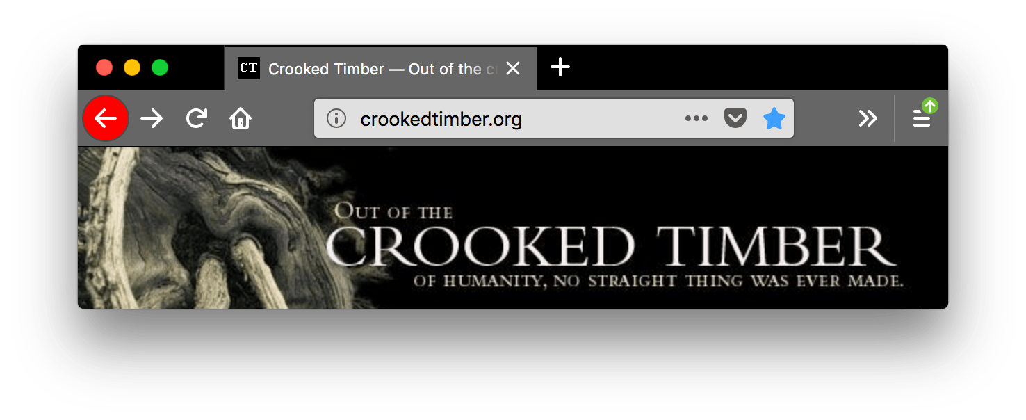
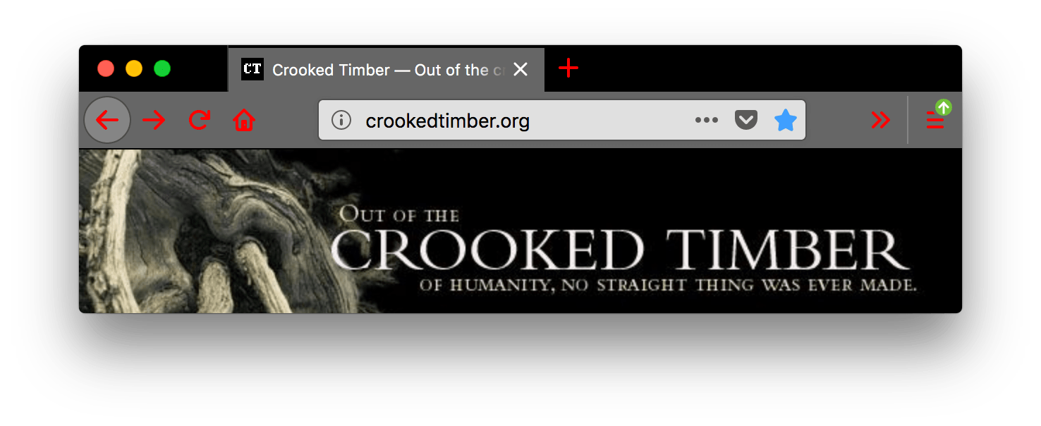
toolbar |
The background color for the navigation bar, the bookmarks bar, and the selected tab. This also sets the background color of the "Find" bar.
See example
"theme": {
  "colors": {
    "frame": "black",
    "toolbar": "red",
    "tab_background_text": "white"
  }
}
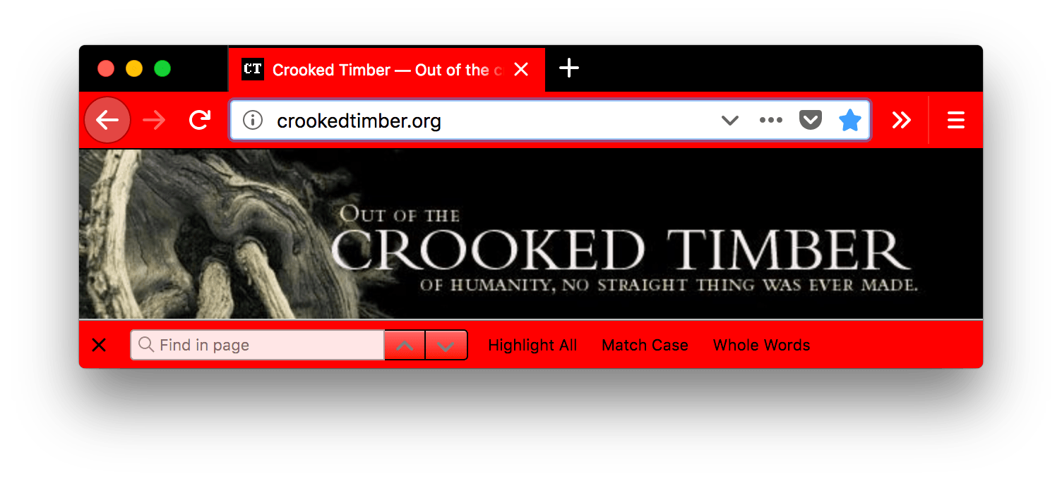
|
toolbar_bottom_separator |
The color of the line separating the bottom of the toolbar from the region below.
See example
"theme": {
  "colors": {
    "frame": "black",
    "tab_background_text": "white",
    "toolbar_bottom_separator": "red"
  }
}
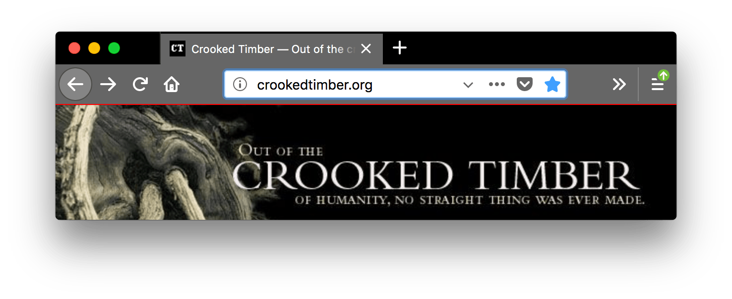
|
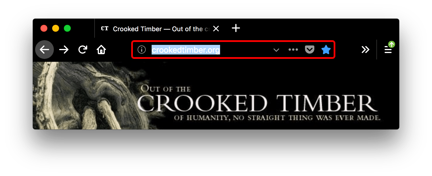
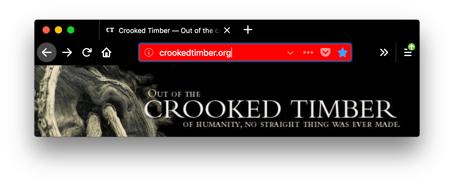
toolbar_field |
The background color for fields in the toolbar, such as the URL bar. This also sets the background color of the Find in page field.
See example
"theme": {
  "colors": {
    "frame": "black",
    "tab_background_text": "white",
    "toolbar_field": "red"
  }
}
|
toolbar_field_border |
The border color for fields in the toolbar. This also sets the border color of the Find in page field.
See example
"theme": {
  "colors": {
    "frame": "black",
    "toolbar": "black",
    "tab_background_text": "white",
    "toolbar_field": "black",
    "toolbar_field_text": "white",
    "toolbar_field_border": "red"
  }
}
|
toolbar_field_border_focus |
The focused border color for fields in the toolbar.
See example
"theme": {
  "colors": {
    "frame": "black",
    "toolbar": "black",
    "tab_background_text": "white",
    "toolbar_field": "black",
    "toolbar_field_text": "white",
    "toolbar_field_border_focus": "red"
  }
}
|
toolbar_field_focus |
The focused background color for fields in the toolbar, such as the URL bar.
See example
"theme": {
  "colors": {
    "frame": "black",
    "toolbar": "black",
    "tab_background_text": "white",
    "toolbar_field": "black",
    "toolbar_field_text": "white",
    "toolbar_field_focus": "red"
  }
}
|
toolbar_field_highlight |
The background color used to indicate the current selection of text in the URL bar (and the search bar, if it's configured to be separate).
See example
"theme": {
  "colors": {
    "toolbar_field": "rgba(255, 255, 255, 0.91)",
    "toolbar_field_text": "rgb(0, 100, 0)",
    "toolbar_field_highlight": "rgb(180, 240, 180, 0.9)",
    "toolbar_field_highlight_text": "rgb(0, 80, 0)"
  }
}
Here, the toolbar_field_highlight field specifies that the highlight color is a light green, while the text is set to a dark-to-medium green using toolbar_field_highlight_text. |
toolbar_field_highlight_text |
The color used to draw text that's currently selected in the URL bar (and the search bar, if it's configured to be separate box).
Note: Ensure the color used contrasts well with those used in toolbar_field_highlight.
See example
"theme": {
  "colors": {
    "toolbar_field": "rgba(255, 255, 255, 0.91)",
    "toolbar_field_text": "rgb(0, 100, 0)",
    "toolbar_field_highlight": "rgb(180, 240, 180, 0.9)",
    "toolbar_field_highlight_text": "rgb(0, 80, 0)"
  }
}
Here, the toolbar_field_highlight_text field is used to set the text color to a dark medium-dark green, while the highlight color is a light green. |
toolbar_field_separator Deprecated |
Warning: toolbar_field_separator is not supported starting with Firefox 89.
The color of separators inside the URL bar. In Firefox 58 this was implemented as toolbar_vertical_separator.
See example
"theme": {
  "colors": {
    "frame": "black",
    "toolbar": "black",
    "tab_background_text": "white",
    "toolbar_field_separator": "red"
  }
}
In this screenshot, "toolbar_vertical_separator" is the red vertical line in the URL bar dividing the Reader Mode icon from the other icons. |
toolbar_field_text |
The color of text in fields in the toolbar, such as the URL bar. This also sets the color of text in the Find in page field.
Note: Ensure the color used contrasts well with those used in toolbar_field.
See example
"theme": {
  "colors": {
    "frame": "black",
    "toolbar": "black",
    "tab_background_text": "white",
    "toolbar_field": "black",
    "toolbar_field_text": "red"
  }
}
|
toolbar_field_text_focus |
The color of text in focused fields in the toolbar, such as the URL bar.
Note: Ensure the color used contrasts well with those used in toolbar_field_focus.
See example
"theme": {
  "colors": {
    "frame": "black",
    "toolbar": "black",
    "tab_background_text": "white",
    "toolbar_field": "black",
    "toolbar_field_text": "white",
    "toolbar_field_text_focus": "red"
  }
}
|
toolbar_text |
The color of toolbar text. This also sets the color of text in the "Find" bar.
Note: For compatibility with Chrome, use the alias bookmark_text.
See example
"theme": {
  "colors": {
    "frame": "black",
    "tab_background_text": "white",
    "toolbar": "black",
    "toolbar_text": "red"
  }
}
|
toolbar_top_separator |
The color of the line separating the top of the toolbar from the region above.
See example
"theme": {
  "colors": {
    "frame": "black",
    "tab_background_text": "white",
    "toolbar": "black",
    "toolbar_top_separator": "red"
  }
}
|
toolbar_vertical_separator |
The color of the separator in the bookmarks toolbar. In Firefox 58, it corresponds to the color of separators inside the URL bar.
See example
"theme": {
  "colors": {
    "frame": "black",
    "tab_background_text": "white",
    "toolbar": "black",
    "toolbar_vertical_separator": "red"
  }
}

|